

This month we are going to take a look at the art and living space of artist, Susan Ludwig. Susan specializes in mixed media collage. above is a collaged self portrait. We are going to look at how this talented artist creatively mixes color and texture in her collage work as well as in her furnishings. Susan's home is a symphony of color. Her possessions are mostly thrifted and gifted.

First, we begin with a glimpse of her workspace. Simple pencils and markers create a little sculpture.

There are pockets of "theater" all around Susan's home. Here in the dining room, we see a ceramic dish framed by an oval tray. The two look connected. It is important to layer your accessories. Unusual colors are placed together to form an interesting grouping.

Also in the dining room are a collection of cigar boxes when stacked become sculptural. What a great idea to place these next to a buffet, usually dead space in a room. The repetitive nature of the boxes work well with the stained Popsicle stick lamp beside it, also in repetition. Repetition can also be found in her use of mirrors even though the frames are different, just like all the different boxes. Repetition in an interior creates a balance and acts as a kind of anchor to support all the one of a kind things that surround the space.
Below we are looking at a close up of the kitchen cabinets.
 Susan has taken a checkerboard pattern and applied it to white metal cabinets. The overlays are old National Geographic magazine covers. The checkerboard is repeated in the back splash. The bursts of color are layered over the squares like the oval tray which is layered are with the ceramic dish. The high contrast of color and the high contrast of black and white are quite dramatic in an otherwise small kitchen.
Susan's living room has little treasures wherever you look. Below we see a collaged screen made of folding doors.

There are scraps of sheet music that are introduced to you by a bust of Beethoven himself! The screen becomes textured and performs as a backdrop for a variety of collected illustrations.
Below, the mantle becomes a stage for collectibles positioned in an interesting way. It is important to visually connect the wall and mantle (or a table) when you are accessorizing so that your eye moves around.
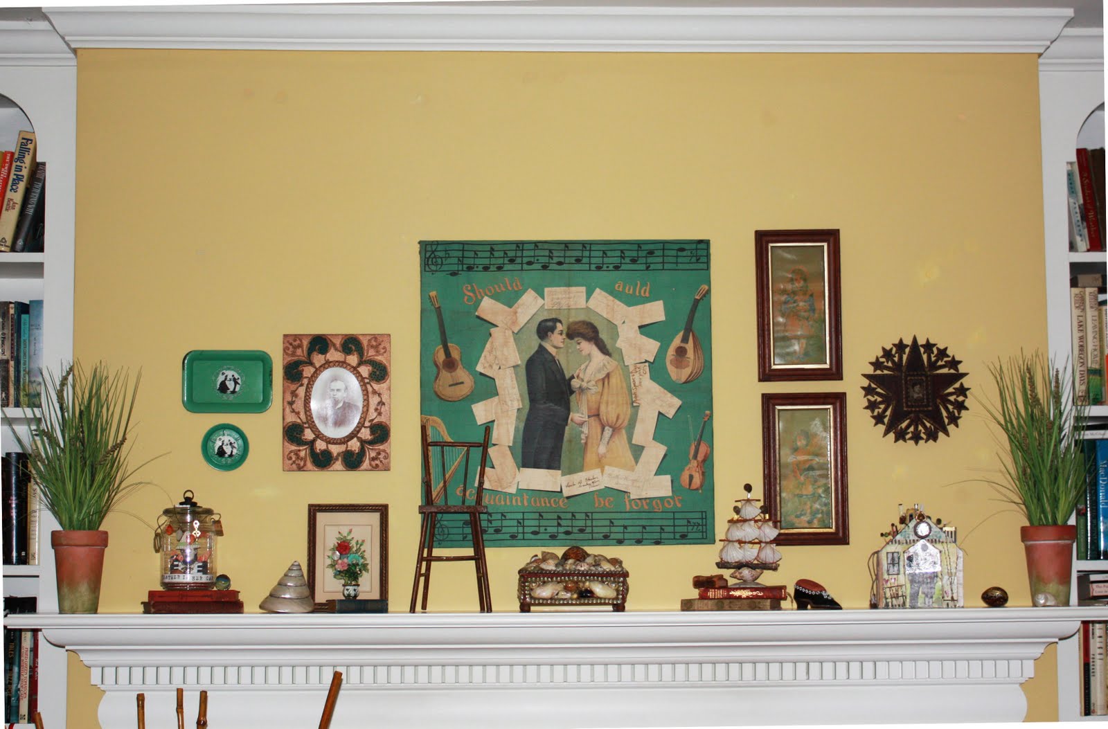
To help make this connection, the mantle items intersect the pictures above.
Let's take a peek at the powder room.

If you need privacy, forget draperies, why not obscure the window view with art? In a small space, decorate with small accessories. The collection of shoes in graduated size make an ordinary windowsill and unlikely stage.
The bedroom is full of surprises.
 This flea market chest has a painted surface and is decorated with buttons.
The nightstand illustrates the repetitive design of the cigar boxes, only this time, old suitcases have been used.

One of the most innovative ideas can be found in the bed area. Here, Susan paints found spindles of wood in different colors and uses them as a headboard AND they double as picture frames. Also, notice the variety of colors and textures on the bed's landscape of pillows.

We've seen wonderful vignettes of objects places all around the home. Let's take a look at some of Susan's art! Here are a series of collages that she enjoys creating and has been exhibiting for many, many years.


The last photo before we get to my interview with the artist, is an example of a french tile technique called Pique Assiate, a special type of mosaic. Susan has covered her brick walls and surrounding windows as well as bowls, tables and picture frames with her unique tile work.

Here are a few questions I love to ask artists to find out what makes them tick.....
How would you describe your style?
Eclectic.....My motto is "Let no surface remained unadorned."
What is the one thing you could not live without?
Laughter, ice tea with lemon no sugar.
What is your most prized possession?
My stash of "stuff".... old, new, frivolous and unique.
What inspires your creativity?
Anyone or anything i see that engages me... particularly something I can re purpose in an unusual manner. Art materials such as Sharpie's new Poster Paint pens and Caran d'Ache 11.
If you could collaborate with someone on a project, who would it be and why?
Henri Matisse without question. I would like to have been an apprentice to this master of color and pattern.
If you would like to see older posts and take a look at my full blog page, please go to www.Merlehillaryinteriors.blogspot.com.

 This is Ari Seth Cohen and one of his favorite photographic subjects, Mimi, a former model and actress.


